Building a design system where the code leads and Figma follows

The handover-era workflow, rebuilt around code, tokens, and an MCP loop into Figma
- Who
- Self-initiatedJul 2026
- Tools
 Storybook
 Figma
Figma Claude AI
 GitHub
- Links
- View projectGitHub Repo
Context
Design systems used to be handed over, now they're code and Figma sits downstream
For years the handoff was the whole game, a designer built the components in Figma, redlined them, and threw them to engineering to rebuild in code, and the two drifted apart the moment they shipped. That's inverted now, the code is the system, Storybook is where it's documented and reviewed, and Figma has moved downstream to mockups and exploration, kept in sync rather than treated as the source.
AI and MCP tooling are a big part of why it flipped, since generating and wiring a real system in code is finally quicker than maintaining a pixel-accurate mirror by hand. This is that build, done the current way, end to end.
The brief
A design system with nothing real to answer to is just a UI library, so I built this one around a risk analyst and the AI report she has to trust
Her firm generates its daily risk and compliance reporting with AI, and she's the human in the loop who reviews it, signs it off, escalates, or overrides. So the question she opens with every morning has two halves, what needs my attention today, and how far can I trust the machine's read on it.
The second half is the harder one, and it's what the fintech set was built to answer, the confidence scores, the provenance, the audit trail, and the disclaimers that show her where the model is sure and where it isn't. Designing the whole system against her problem is what kept it honest, because you never invent components like those against a generic wall of buttons and cards, you build them because someone real has to make a decision from what they show.
The build
I built it code-first and staged the whole thing in the open
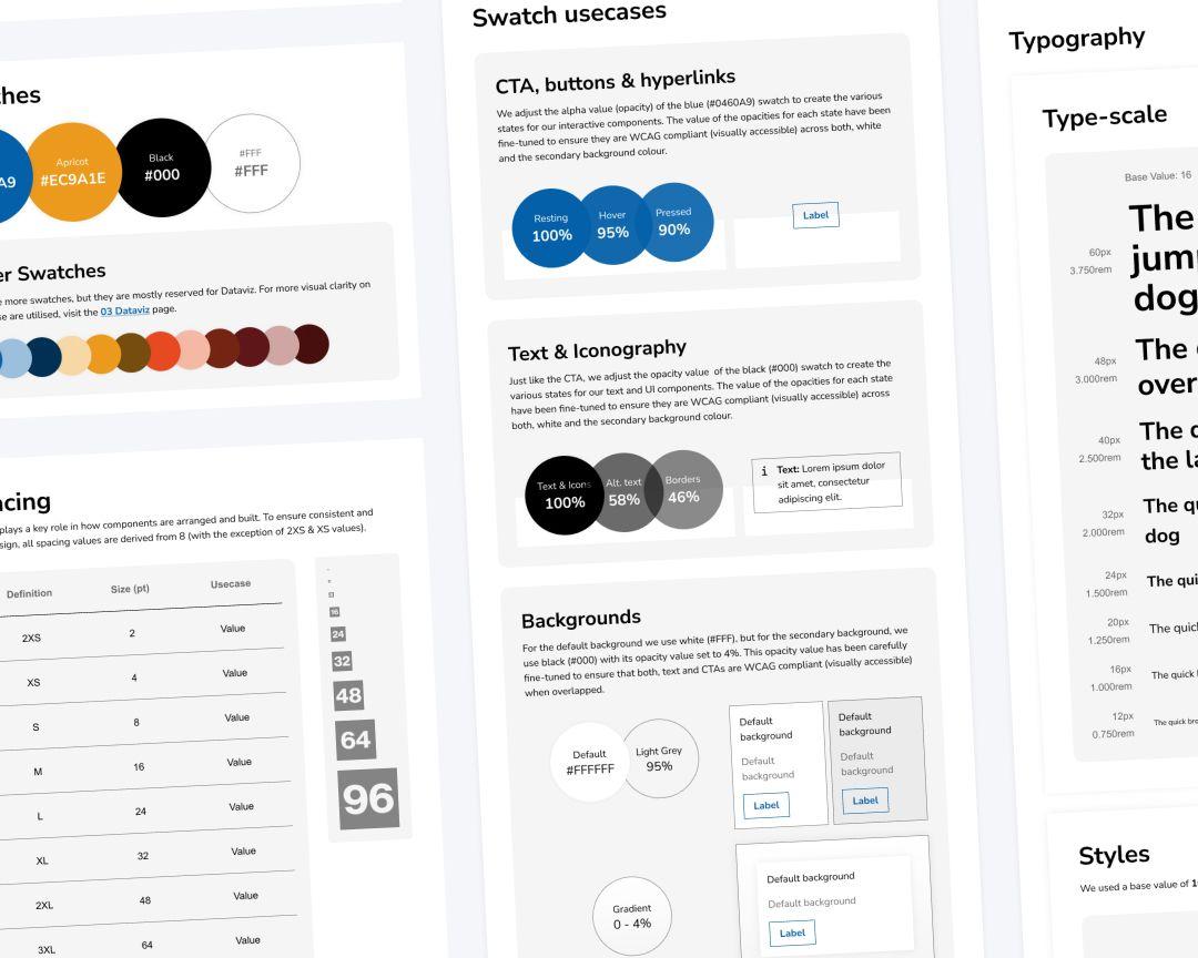
Tokens are the spine, a DTCG source compiled through Style Dictionary to CSS variables, with the colour layer sitting on top as a semantic theme that references Tailwind's palette directly, all of it consumed through Tailwind v4's @theme, so nothing hard-codes a value and every component reads from one source. The components sit on Radix primitives, styled with Tailwind with the utility classes kept internal so each one exposes a clean typed API, over fifty in all, the fintech set among them.
The charts followed the same logic, built on visx primitives rather than a batteries-included library, so a candlestick or a confidence interval is a token-themed component with a typed API like everything else, and the ConfidenceChart puts the model's uncertainty on screen as a band instead of a single false-precise line. Quality is wired in rather than bolted on, 229 unit tests with accessibility checks on every component and eight Playwright end-to-end tests, all gated in CI, and the whole build is public and staged milestone by milestone in the releases, from the empty repo to v1.4.0.


The Figma loop
Figma is generated from the code, with each component pointing back to its source
The link runs the unusual direction, code to canvas rather than the other way, so the design library is built from the same components that ship, pushed through Figma's MCP write loop. Tokens sync as Figma variables and components generate as real frames, and to tie each one back to its source each component's description links straight to its Storybook page, the one canonical place that already carries the props, usage, and code, so nothing is duplicated in Figma to drift out of date.
Figma’s Code Connect is the tool built for that link, and I'd have used it, but it wasn't on my licence when I built this, so the description became the manual version of the same idea, the link sitting on the component where anyone inspecting it would find it. It keeps Figma useful for exploration and presentation without letting it drift from the code.

The Figma craft
MCP gets the look, not the structure, so I rebuilt each component the way its code counterpart is built
The write loop generates the aesthetics and stops there, so a component lands looking right but structured flat, and that's the gap where a designer has to steer rather than trust the tool. So I went through and built each one up the way its TypeScript counterpart is, auto-layout standing in for flex, subcomponents composed and nested atomically rather than pinned in as a flattened picture of themselves. It's invisible until someone actually uses the library, and then it's the whole difference, because a properly composed component resizes, rearranges, and configures cleanly in a mockup where a flat one falls apart the moment you touch it.
The same care went into the parts Figma does well, so the Accordion uses Slot to take real content without the instance-detaching that used to sever the link to the source, and the motion tokens carry timing and easing per token into prototyping, so a prototype animates on the exact values the components ship with. None of it is automatic, the MCP bought speed and the structure was mine to get right, which is what makes the library something a designer can actually work in rather than a flattened export nobody can build on. That's the line between a UI library and a design system a whole team can use.
Where it's at
It ships as versioned packages and keeps itself honest through CI
The proof it holds up is that same fintech dashboard, where everything on screen is a library component and the app writes only the layout and data on top, consuming @gykmi/tokens and @gykmi/ui the way any other team would, which is the only real test of whether a system works outside the workshop.
It stays maintainable because the discipline is enforced rather than remembered, a component change can't merge without a changeset, a breaking one can't land without a migration note, and every release writes its own changelog.
The words are held to the same bar, linted in CI with Vale against rules written for a regulated product rather than a generic style guide, so a promissory claim fails the build the way a broken type would, and the voice stays consistent without anyone policing it by hand. It's public, versioned to 1.4.0, and still moving.